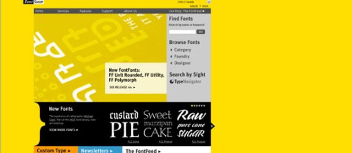
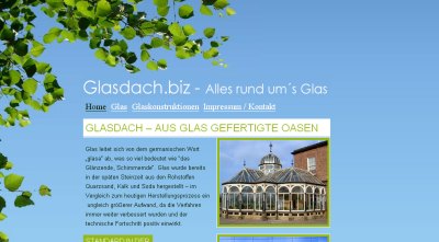
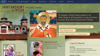
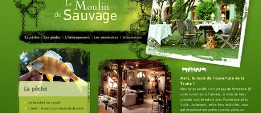
COLOR COLOR !!!
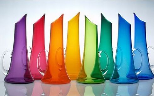 title image courtesy: colourlovers.com
What is COLOR ?
Wiki says ” Color is the visual perceptual property corresponding in humans to the categories called red, blue, green, yellow and others. “
Briefly we can say that color is the main ingredients of human expressions. This main ingredient have its own specific Behavior and Trends.
Color Behavior is the effect of particular color on human behavior and feelings. The behavior is constant, i.e. it does not changes with time and domain. For example, the behavior of white color is still the same i.e. purity, peace and other positive behaviors.
Color Trends is the translation of color for-casting done by professionals in the fields of color research, marketing, designing, fashion and others. The Trends oftenly changes with time and domain, for example the colors trends in 1980s and colors trends in 2009/10. Color trends may vary with the variation in the domain, for example the red color shades used in emergency services, hospitals, etc and the red color shades used in some matrimonial sites, greetings, etc.
So a designer must know these behavior and trends and must stay updated with these important key factors to build his/her business healthy(and wealthy too). I have tried to fetch some very useful informations about color behavior and color trends, which I believe will help any designer.
Color Behavior: (I have mentioned the very common behaviors of colors.)
 courtesy : colourlovers.com
Color Trends: (I have mentioned the very common trends of colors.)
Welcoming:
Yellow-Orange or Amber combinations are the most welcoming. Yellow with little Red shades also creates radiants appealing. Monochromatic color scheme of Saffron used with White creates very inviting and classic appeals.
Moving:
Bright Yellow shades gives very active, constant motion and life-giving sun expressions. To enhance or increase the expression of motion or activity the contrast combinations of Yellow and Violet can be used. These palettes generates movement, especially within a round space.
Elegant:
The palest tints can be used to create elegant color combination, such as, little Yellow and White creates pastel Cream, which can be used to create warmer version of all-white room. Palettes that combine hues similar to the color of eggshell and linens are compatible with most outer hues and offer a workable alternative to achromatic white or non color schemes.
Trendy:
What’s ‘in’ today may be ‘out’ tomorrow. Chartreuse is the best example of accent color used is youthful and off-beat objects. Such hues are used in countless color combination used in fashion from sneakers to sweaters. A combination of exquisite contrast is yellow-green or chartreuse paired with its perfect complement, magenta.
Fresh:
Equal amounts of blue, green or yellow creates healthy and fresh impression. Using colors analogous to green on the color wheel will create strong combinations that resemble vivid, outdoor environments. Such as newly mowed grass on a clear day, sky blue and green always look fresh and natural together.
Traditional:
Historical significances can be used to create traditional color combinations. Colors such as conservative blue, burgundy, tan or green creates traditional themes. Hunter green with deep golden burgundy or black expresses richness and stability. Hunter green shades can used commonly seen in the decor of bank and legal offices, creating value and permanence.
Refreshing:
Cool blue-green combined with its compliment, red-orange usually suggests refreshing themes. Blue-green or teak, is fresh and invigorating. To express travel and leisure blue-green in its full hue is used.
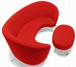
fishy.com.br  ____________________________________________________________________________________________ Some extra visuals showing the color behavior and color trends
  —
—  —
—  —
—  —
—  —
—  —
— ![egg_phone3[5]](https://yayeps.wordpress.com/wp-content/uploads/2010/01/egg_phone35.jpg?w=150&h=112) — ____________________________________________________________________________________________ References and useful resources:
— ____________________________________________________________________________________________ References and useful resources:
–http://en.wikipedia.org/wiki/Color_symbolism_and_psychology http://en.wikipedia.org/wiki/Color
–Color:is it real and does it impact behavior?
–ColorLovers: color trends + palettes
–http://www.divinecaroline.com/22189/68794-seeing-red–color-alters-behavior
–http://www.colour-trends.com/
–http://www.squidoo.com/colortrends
–http://www.archithings.com/color-trends-2010/2009/10/04
–http://www.colour-affects.co.uk/how-it-works____________________________________________________________________________________________ So this is it from my side, now its your turn to yep. Feel free to add comments. Let’s share pretty things!


